Vikings and the Missing Email
Or, how the British Museum failed to get a Viking geek raving about their latest Viking exhibition…
The Vikings are in my blood as half my family are Danish and to say I have a bit of an interest in the Vikings is a bit of an understatement. It’s a real passion of mine and something I love spending my spare time researching and exploring.
Over the last few years I’ve visited many exhibitions about the Vikings. From the Jorvik Viking Centre in York to the Viking Boat Museum in Roskilde, Denmark. So when the new Viking exhibition at the British Museum in London was advertised, I naturally jumped at the chance to take my family along and check it out.
“THE Viking exhibition to end all Viking exhibitions”
With high hopes and excitement we embarked on our day out to the British Museum, but unfortunately our high hopes were quickly squashed and our day out left us feeling underwhelmed. On reflection there were just some small tweaks that the museum could have made to customer journey to make massive improvements. With a bit more forethought into user experience (something we really take time on here at Pretty) it could’ve been the best Viking exhibition I’ve ever attended, instead it was lacking in some key areas:
Oversubscription
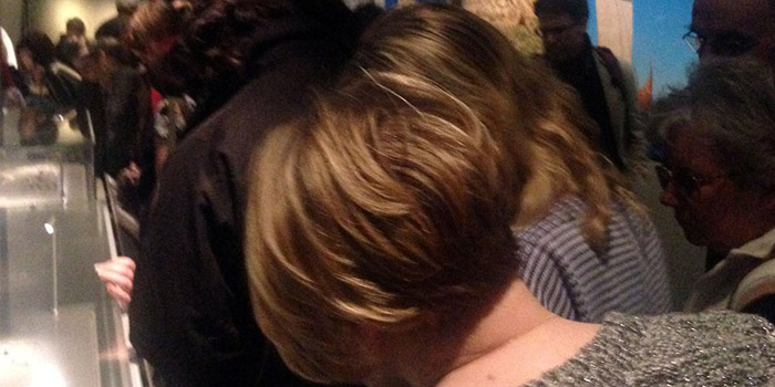
As with any new exhibition which is heavily promoted, it was massively oversubscribed. It was one of the first things that struck us when we arrived at the museum - there were so many people all crowding into the exhibition space. It’s understandable that the museum would want to sell as many tickets as possible, especially with such a fantastic selection of artefacts on show, but with numbers like that comes a responsibility to manage them effectively.
The sheer number of visitors meant there was a mass of people pushing and jostling to see what was on show - like pilgrims trying to pass religious artefacts! The crowd mentality had set in and the result was people young and old pushing and shoving their way to the front to see what was on show. It wasn’t a pleasant experience for us as adults, let alone our children.

Confusion
Whilst squashed up against other disgruntled visitors it became apparent from listening to various conversations that confusion was rife. No one really knew what they were looking at, and they didn’t know what was on show before they had turned up to the exhibition. People had come hoping to be educated whilst they were there (like us) but unfortunately, and quite remarkably for the British Museum, the education and engagement around what was on show was seriously lacking.
I am still unsure whether this was a vain attempt to get people to buy the associated book or pay extra for audio guides, however if that was the case neither were pushed on us as we entered the exhibition and we were left wondering what all these things in front of us were and what their significance was.

Poor signage
The signage for each exhibition piece was placed incredibly low to the ground, which although would have helped wheelchair users, meant they were blocked out by all the people walking past them and crowding around.
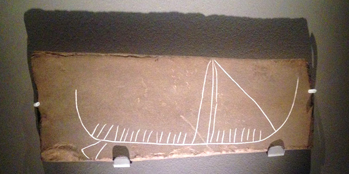
When we did get the opportunity to read the signs, there was very little insight and story given to help you understand the context of what was on show. For example, they had managed to get the York Horde into the exhibition - but I didn’t know anything about it and couldn’t tell how important an artefact it was until I had gone home and looked it up on Wikipedia. It would have been much more exciting if I’d known a bit about what I was going to see, how important the objects were and a little bit more about them.
It was at this point that I started thinking it was my fault for failing to prepare and do a bit of background research for the exhibition in advance. I’d had a busy week at Pretty and just turned up expecting to be educated. Was I asking too much?
It strikes me now however that the fault ultimately lies with the organisers of the exhibition, and that they could have taken three simple steps to ensure the experience was exciting as it promised to be:
- Shared information before the exhibition What my family and I really needed was an information or ‘preparation pack’ before we arrived so we could plan for the trip and get excited about what we were going to see on our journey to the museum. It needn’t have been anything too fancy like a printed pack or booklet, a simple email would have sufficed. Details about where to go and how to get there, facilities, things for the kids to see and do and also which key artefacts were on show would have been started to get me excited and up to speed with the exhibition. The tickets were emailed to us, so there’s no real excuse for not adding a bit more info in at this stage. I’d have also enjoyed hearing what other visitors thought were the highlights, what the staff and organisers recommended and perhaps a few left field details to satisfy the Viking geek in me! (Such as the fact that the Jelling Stone recreated for the exhibition is in the front of all Danish Passports).
- Better signage, information and crowd control throughout Simple user experience strategies as I mentioned above to ensure everyone has a pleasant and enjoyable experience would have saved this exhibition from being a flop and a bit of a rubbish family day out.
- Post exhibition engagement We received no follow up email from the museum after our visit, despite them having our email address. This simple addition to their strategy would have ensured they’d collect valuable feedback, discussion and even encouraged sharing on social media and online - which would further develop the relationship between the museum and their visitors, increasing loyalty, positive sentiment and their overall reach. What a missed opportunity!
 Jelling Stone and a Danish passport
 Digital strategy for a better user experience
This ultimately leads to a broader digital strategy the museum could adopt to encourage engagement around their exhibitions and get visitors exploring everything the museum has to offer, but that’s for another time. What I will say is this - if you’re thinking of going to the exhibition, don’t let my poor experience stop you - just plan and prep before you go so you can make the most of the incredible pieces they have on show.
And… if you work for the British Museum and are reading this, a simple email and some thought to user experience for your next exhibition will make the world of difference.
