Case study: Dining Solutions

Making takeaway ordering responsive

Project duration
2 months
Disciplines
Research & strategy
User experience design
User interface design
Front end development

After successfully supporting the creation of their first website back in the mid noughties, Dining Solutions returned to us with a new brief. To make their site responsive and mobile-ready to catch the new wave of people ordering takeaways from a mobile device. The process was straightforward… We documented the existing site. Discovered what the mobile version needed to do. Drew wireframes and came up with countless ideas. Stripped those ideas right back and simplified. We tested and we modernised. The result? Hungry customers ordering chicken tikkas from the local curry house, from their phones, from the comfort of their sofa.

A revolutionary online takeaway service

SM “Dining solutions are an online takeaway ordering service who offer small and local takeaway restaurant businesses the system and chance to offer their menus online. They provide everything - the system, the website - even the flyers and marketing the takeaway’s new online service. They’re offering a full end to end solution.”

TS "And Dining Solutions was there long before the mass online takeaway services hit the market, they were revolutionary really. What they’re offering is a website and system that is customisable and that the small independent takeaway can use to access a customer who now wants to order their favourite meal from the comfort of their sofa.”

SM "Exactly, there’s definitely a shift now. Which is why they came back to us to take the initial site we had designed for them and bring it up to date, with a responsive version that works on desktop, laptop, tablet and phone.”

TS "It’s worth stepping back and reminding ourselves of what we did for Dining Solutions when we first worked with them, to give a little context”

SM "We met Trevor, the owner of Dining Solutions back in 2006 when he approached us to work on the first Dining Solutions website. They already had a tech team onboard so we tackled the user experience and visual design of the site.”

TS "The feedback from the client and the customers was great - we built a site which just worked, and was really easy to use.”


dining-solutions-site
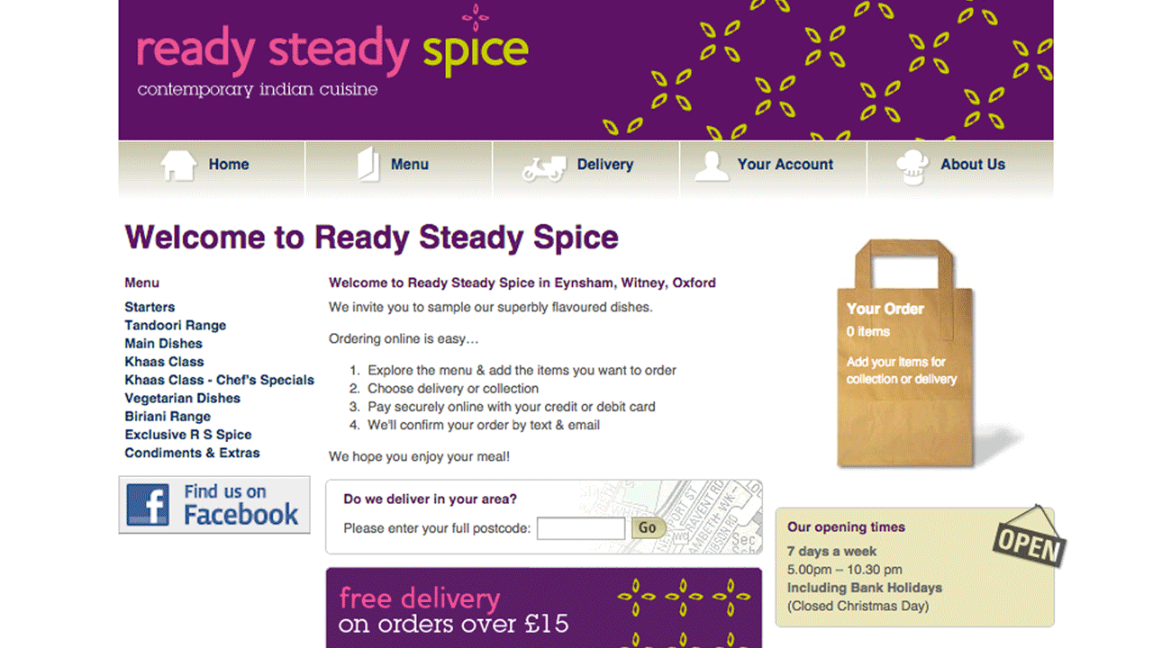
Dining Solutions first site that we built in 2004

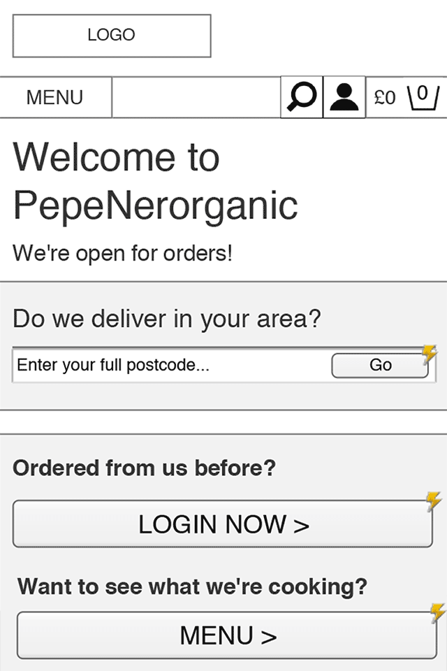
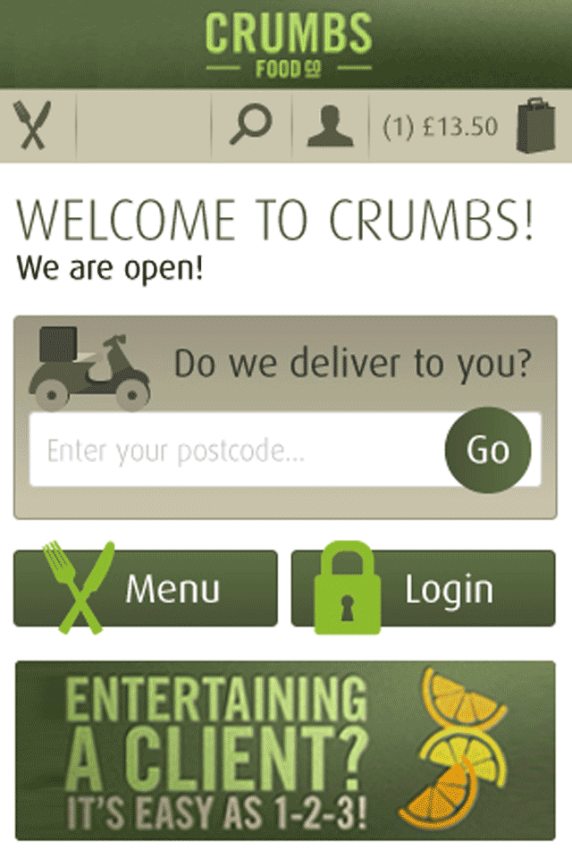
A new way of ordering

A few years on, and with the ‘big boys’ biting at their heels, Dining Solutions realised it was time for an update. They needed a responsive site, for a new mobile savvy audience.

SM “When they came back to us, they told us that they loved the processes as they were, the website as it is and didn’t really want much to change in the way they used it.”

“The new project was to not really to overhaul what already existed, because it works really well.”

SM “The new project was to not really to overhaul what already existed, because it works really well. Like we said, the feedback on the site user experience had been great, so we wanted to ensure it stayed like that!”

"Great system. Works really well and as long as it is here in time it is the best ever and I will definitely use again."
"Hi, your website is fab and easy to navigate around, and as always your food is of the highest quality."
"So far, very slick. Easy to use. Accurate. If the delivery arrives on time and the driver follows the instructions I’ll be super impressed."
"I would like to compliment you on your website. We are part of the silver haired community and ordering online is not natural for us but you made it easy."

TS "Instead we were tasked with keeping the simplicity and the way the site worked but modernise the look and feel of it and make it work on tablet and mobile. This meant we had to look again at customer journeys, flows and usability. Browsing the web on smaller screens is a totally different ball game to doing so on desktop, and so we had to address users' behaviour and needs on these devices."

Understanding the takeaway user

TS "What made the process of understanding the takeaway user easier was that Dining Solutions know their clients inside out - and knew that the simpler the processes, the better. We had a lot of discussions with Trevor, the founder of Dining solutions, when we first started working together on the first site, and for this new updated version. He spends the majority of his time with independent takeaway owners, and gathering feedback on how the site is working for them and their customers. He made it very clear that what we initially built for them just works, so we shouldn't overcomplicate it."

SM “It was looking at the two main types of user that really cemented the processes we needed for Dining Solutions. We spent a lot of time working our way through how you would order food online. We thought about how you might be doing it late at night, maybe you’ve had a few to drink!”

TS "But Dining Solutions also had information on who actually uses their site, so we knew that there was also a lot of older people using it - who perhaps aren’t so digitally savvy. They may be a more senior user group but they still order online, and even more so these days with the rise of the tablet."

SM “Which is why we considered customer journeys for two core audiences:”


1. People who are new to system

These users perhaps want to browse the menu than existing users and discover what's on offer. They first thing they need to know though, is whether the takeaway delivers to their area - pointless otherwise!


2. People who use it all the time

These users likely know what they want, and may well order the same, or similar each time. For these customers we could consider functionality such as saved orders, recommendations and favourites.


SM “What we discovered about both audience types was they wanted the experience to:”


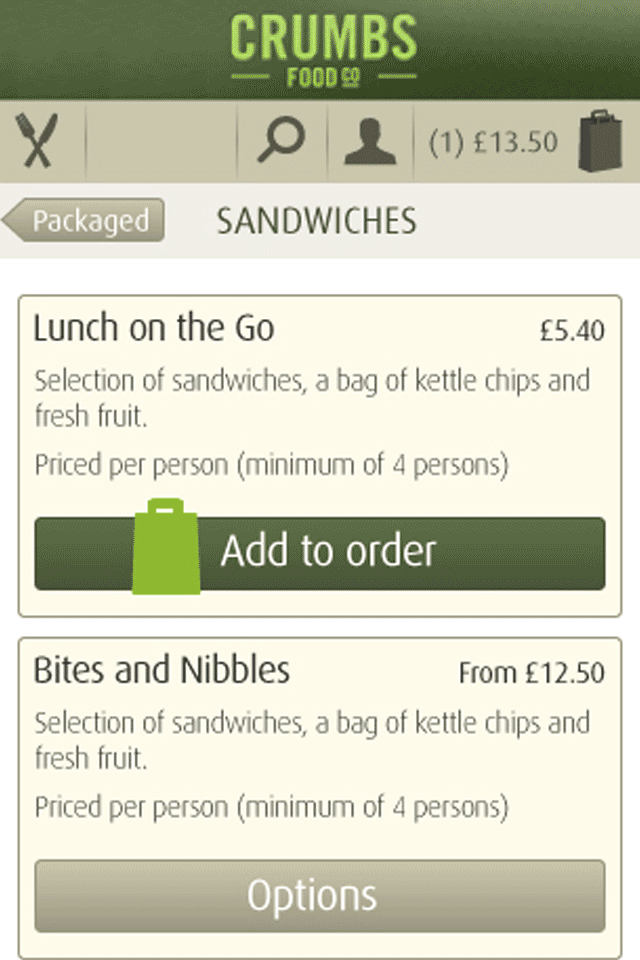
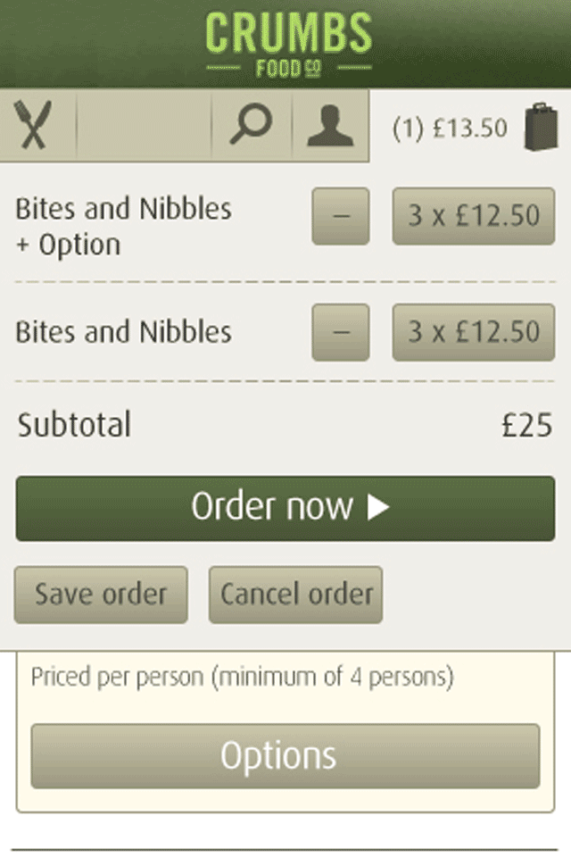
Be clear and easy to browse

Both new and existing customers want the site to be easily browsable. They want it to be easy to choose what they want to order, see what they’ve got in their ‘basket’ and see how much the order totals to. They also want to be able to find how to pay quickly.

Be faceless

Users don’t want to talk to anyone at the takeaway when they’re ordering online. They just want to order and forget about it until it is delivered. This meant keeping it very straightforward and ensuring no instances arose when the customer would have to pick up the phone to check the order was received ok or ask troubleshooting questions.

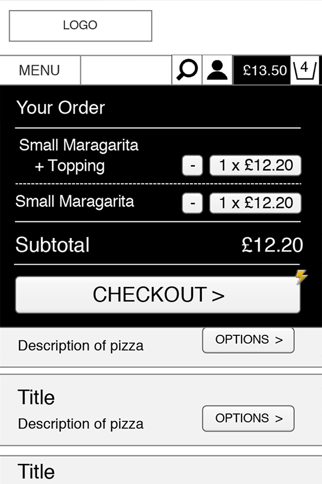
Be quick to use time and time again

Once a user has decided what to eat, they just want to complete the order as quickly as possible. The checkout process should be streamlined and fast, with as few steps as possible and the option to save your details for next time.
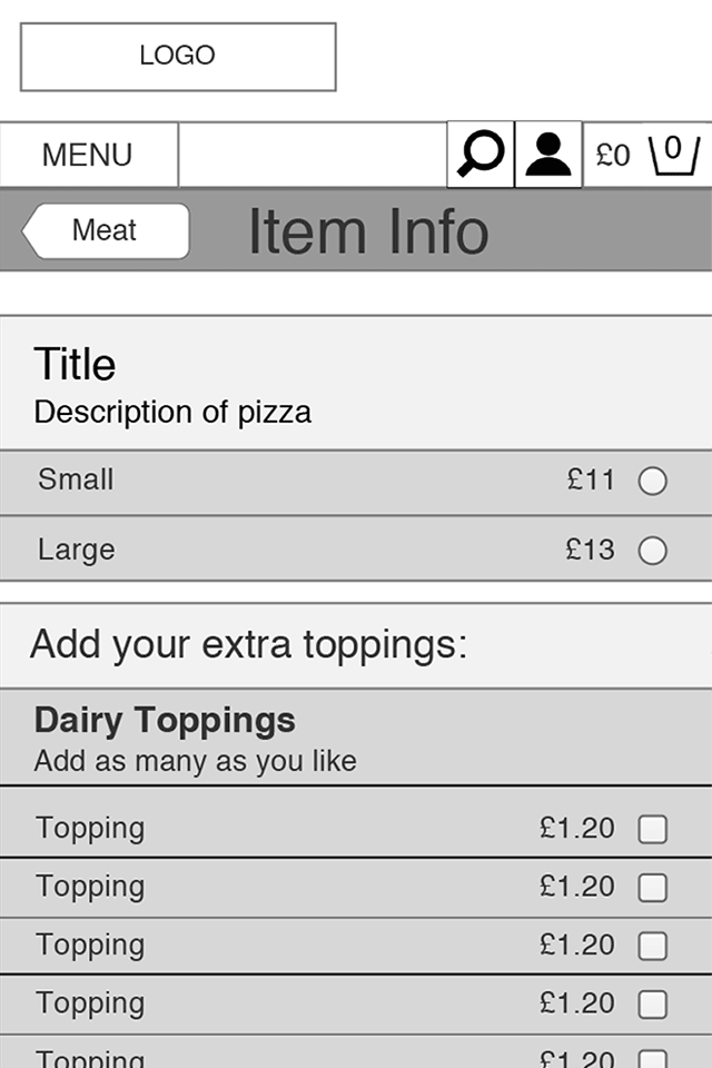
Be customisable

For most takeaways, there needs to be an option to customise an order. The best example being a Pizza takeaway , where you get to choose your toppings and types of base. But there’s also the need for people to let the takeaway know if they have any dietary requirements or food allergies - or they simply don’t want peppers in their curry!


Keeping it simple

SM “Going back a few years later, we needed to refresh our memories of the previous site and so we documented the structure, the user journeys and the flows. From that we could then work out what the key processes were and what needed to be improved and tweaked. That gave us some key discussion points to work from with the client.”

TS "We looked at the ordering system specifically and we also looked at other online ordering and shopping sites - Dining Solution’s competitors. We documented the browsing and ordering processes of those sites to get an idea of what their users want and what users of a similar product expect in terms of functionality and how it worked."

“The key thing that came from that research phase was to simplify the flow for mobile - it needed to be single featured because visually it’s very different to desktop - there’s less room and it requires a completely linear flow to work seamlessly.”

TS "The key thing that came from that research phase was to simplify the flow for mobile - it needed to be single featured because visually it’s very different to desktop - there’s less room and it requires a completely linear flow to work seamlessly. It needs to replicate the existing process on a mobile device, with features that work specifically on phones and tablets."

SM “And we worked that out by drawing lots of pictures! We worked on low fidelity wireframes - sketches of wireframes showing how a mobile version of the site could work and ideas which could be added for better functionality. We had some ideas that we thought could be useful to add in, such as:”


  • Geo-location based 'do we deliver? functionality'
  • Recommended takeaways if delivery is unavailable
  • Alerts when a takeaway starts delivering in your area
  • 'Have your forgotten?' prompts
  • 'Other customers have also ordered' prompts
  • dining-solutions-wireframe
  • dining-solutions-wireframe
  • dining-solutions-wireframe

SM “We got all those ideas out on paper and then stripped them all back. Most of them we actually ditched! That wasn’t so surprising as we knew we needed to keep it really really simple but it was a useful exercise to get inside the minds of a mobile user and make sure we weren’t missing anything really key.”

A full working prototype

SM “We took those initial sketches and worked up a few basic interactive wireframes using a piece of software called Axure.”

TS "Not only did it show us what information was most crucial to be shown up front, how the navigation might work and how overlays functioned, it also allowed non-developers to test the processes and journeys and get a sense of how it will work on mobile and tablet."

dining-solutions-prototype

“When you test using a prototype, and as you start using it on a phone and using your thumb instead of mousing over on a screen, it is completely different. You have to actually test and design in context.”

SM “From here, we moved into a full working prototype in code - a black and white version of the site that actually works!”

SM "The point being here that when you see a Photoshop visual it kinda feels like one thing, so you’re not interacting with it really. Generally you design a site in the desktop context on Photoshop - and you can get lulled into thinking it works on mobile, when in fact it doesn’t. When you test prototypes. and as you start using it on a phone and using your thumb instead of mousing it over, it is completely different. You have to actually test and design in context."

TS "By creating a full working prototype we:"


  • Realised geo-location was unnecessary as users know their postcode and are generally know their local takeaways
  • Streamlined the forms and button labelling so it was much clearer
  • Made the language and actionable steps clearer
  • Reviewed the navigation - streamlining and reordering
  • Added in features like having saved orders up front in their account when logged in

SM "You’re not bogged down by the visuals it’s just focusing on the way it works when you’re prototyping."

TS "And really, once you’ve got the black and white HTML wireframe agreed, you’ve delivered half the project. It’s then about turning what was a wireframe into fully ‘coloured in’ designs and functionality."

SM "Which is where the look and feel for the site comes into play. Dining Solutions wanted the look and feel of the site updated for a more modern market. Each independent takeaway who uses Dining Solutions has its own graphics and colour scheme that’s applied."

dining-solutions-visual

TS "So the challenge was to create customisable templates that each takeaway can use and adapt to look like their own restaurant but that is easy for Dining Solutions to update. We overcame this by doing things like focusing on more iconography and updating the look of call to actions such as bigger buttons and typeface."

The Outcome

When Dining Solutions came back to us with great feedback, we knew we’d delivered the goods and created a simple system that just works. But seeing customer comments, from those ordering their food from the couch and finding it intuitive and easy to use, was the icing on the cake for us. The mapping out, wireframing and going back to the drawing board (on more than one occasion!) was all worth it to know that we were helping to bring takeaway food to the homes of hungry customers and helping Dining Solutions continue to grow their business.